The best school website designs of 2026 combine parent-first navigation, authentic storytelling and an admissions path that never makes a family hunt. Standouts like The Walker School, The Dunham School, Gordonstoun, Kent College and Beau Soleil show how clear structure, real imagery and a visible Apply button turn browsing parents into enquiries.
Below are 11 real school website examples, the exact move worth copying from each, plus design ideas, platform advice, costs and a scorecard so your education website design fills seats, not just looks good.
A school website is not a brochure. It is your busiest admissions officer, working every hour a parent is awake and deciding whether to enquire. The strongest sites of 2026, from private and independent schools to online and international schools, design every screen around the next step.
In this guide we feature 11 of the most effective school websites in the world, name the one design move worth stealing from each, and then show you how to apply those moves. You will also find best practices, the mistakes that quietly cost enrollments, and a quick scorecard to grade your own site.
The 11 best school website designs of 2026
These schools span the US, UK, Europe, the Gulf and India, and each earns its place for a specific design decision, not just a pretty homepage. For every one, we have named the single move you can copy on your own site. We start with our Author's Choice, the one site we would point any school to first.
thebinaschool.com
★ Author's Choice
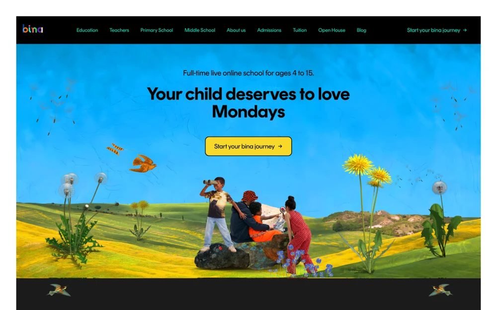
bina Global, online
A full-time live online school for ages 4 to 15, and the most distinctive site in this roundup. Every section is built to feel honest rather than salesy.
What works
Fear-first copy that names the parent's worry out loud: a child genuinely known by their educators, not lost in a classroom of 30.
A real day in the life in reel-style cards, with timestamps and candid phone photos from one student's actual day.
Transparent pricing, sibling discounts and funding sit on the page, next to accreditation logos and testimonials with real faces.
One bold, ownable colour system and a single collage art direction make the brand unmistakable across every section.
What needs work
The maximalist collage and heavy decorative animation are a genuine load-speed and accessibility risk, and hard to execute without bina's craft.
The look is polarising; it suits a bold challenger brand more than a traditional, heritage school.
What to stealLead with the parent's fear, show a real day in the life, and put pricing and proof on the page.
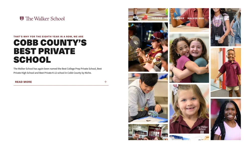
thewalkerschool.org
01
1. The Walker School USA
Walker leads with proof, not a greeting, over a lively mosaic of real student photos.
What works
A proof-led hero: a specific, verifiable claim, Cobb County's Best Private School for the eighth year running, named by Niche, instead of a generic welcome.
An authentic photo mosaic of real students across arts, sports and candid moments, with no stock imagery.
Clean type hierarchy and generous whitespace, with Inquire and Visit kept in the header.
What needs work
No dominant call-to-action button: Inquire and Visit are small text links and Read More is a thin underline. The strongest message has the weakest button.
The value proposition is entirely award-based; it tells you Walker won, not what the day-to-day experience is.
A dead gap in the centre on wide screens, between the left-aligned text and the right-aligned photo grid.
What to stealOpen the homepage with one specific, third-party-verified claim instead of a generic welcome line.
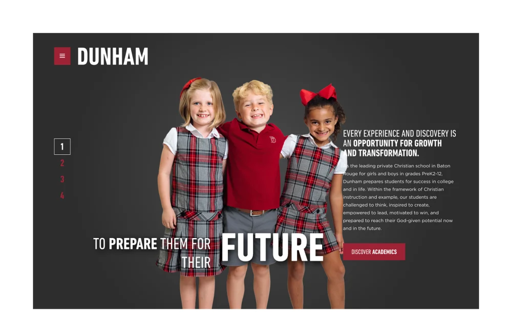
dunhamschool.org
02
2. The Dunham School USA
A bold dark hero and a clear position as Baton Rouge's leading PreK2-12 school, with strong self-select navigation.
What works
A self-select Experience Dunham tab strip lets families jump straight to academics, athletics, arts, spiritual life, student life or community.
Real voices and proof: a student spotlight, a parent and alumna review, partner logos and a SAIS accreditation badge.
An excellent mega-footer organised by Interest, Age, Admissions, Calendar, Giving and Community.
What needs work
Visible broken-image placeholders in the gallery grid. On a best-in-class showcase that reads as neglect and erodes trust.
Carousel-heavy: a hero slideshow plus values and voices sliders. Most visitors never click past the first slide, and the hero slider can hurt load speed.
The hero's primary call-to-action is Discover Academics; the actual Visit and Apply actions sit far down the page.
What to stealAdd an Experience tab strip so parents can jump straight to academics, athletics or student life instead of scrolling everything.
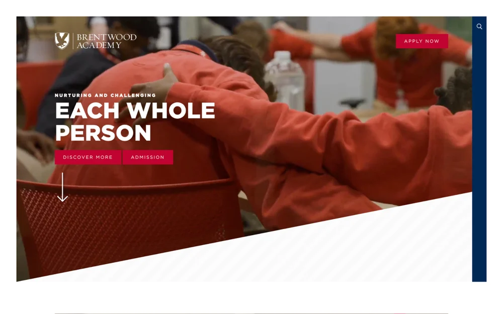
brentwoodacademy.com
03
3. Brentwood Academy USA
An emotive full-bleed hero paired with hard proof numbers and a fixed Apply Now button.
What works
A genuine candid hero photo plus a clear mission line lands an emotional, mission-led message immediately.
Apply Now is fixed in the header on every page, reinforced by Discover More and Admission in the hero.
Hard proof numbers in circular badges: 119 state championships, 100% college acceptance, 400+ robotics awards, 50+ acres.
Clear outcomes via Portrait of a Graduate, and a thorough footer with separate Middle and Upper school contacts.
What needs work
White hero text sits over a busy photo; it is readable, but a gradient scrim would lock legibility on every screen.
A long, dense first scroll before practical information like programs and fees appears.
Faith framing is front-loaded. Intentional for the audience, but it delays the academic proof some parents scan for first.
What to stealPut concrete outcome numbers near the top and keep an Apply Now button in the header on every page.
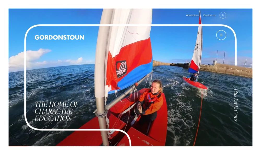
gordonstoun.org.uk
04
4. Gordonstoun School UK
A cinematic, character-led site that sells outdoor education through imagery before a word is read.
What works
The hero, a lone student sailing a dinghy at sea, communicates outdoor, character-building education instantly, with no copy needed.
A strong, ownable identity: the rounded-frame motif, plum accent, elegant serif italics and the French motto Plus Est En Vous feel premium and heritage-led.
Real adventure photography throughout, sailing, mountains, river rescue, community service, backs the Classrooms Without Corridors promise with proof, not adjectives.
Third-party validation is built in, including a Talk Education quote in the Gordonstoun at a Glance block.
What needs work
The conversion path is buried: Admissions is a small top link and there is no high-contrast Enquire, Visit or Apply button in the first screen.
The hero is evocative but light on facts; ages, location and boarding detail sit far down, so a parent scanning for specifics has to dig.
Heavy full-screen video and large imagery are a load-speed risk on mobile, and the elegant serif can lose readability at small sizes.
What to stealLet real adventure photography carry the positioning, then make the enquiry button as visible as the story.
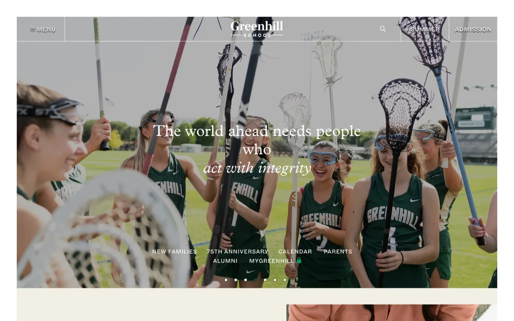
greenhill.org
05
5. Greenhill School USA
A sophisticated editorial site in cream and forest green that connects heritage to ambition.
What works
A confident editorial system, cream and forest green, serif display over a clean sans, that feels premium and timeless rather than templated.
Value-led hero copy, the world ahead needs people who act with integrity, states a worldview instead of a feature.
Then-and-now storytelling, Where we started in 1950 beside Moving the world forward, ties heritage to ambition without a wall of text.
Real student voices: video testimonials labelled by name and class year, Aditya 24, Elsa 32, build authentic trust.
A division timeline (Preschool and Lower, Middle, Upper) plus a tidy news block keep a big site easy to navigate.
What needs work
The hero leads with mission over specifics; ages, location in Addison, Texas, and what is offered sit well down the page.
The main admissions action, Connect with Greenhill, appears late, and there is no high-contrast Apply or Visit button in the hero.
It is a long, content-rich homepage; without stronger scroll cues the news and campus sections compete for attention.
What to stealUse then-and-now storytelling to tie heritage to ambition, and label student testimonials by name and class year.
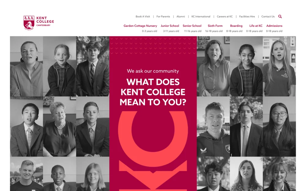
kentcollege.co.uk
06
6. Kent College, Canterbury UK
A bold, community-led site whose age-banded navigation is the smartest detail in this roundup.
What works
Outstanding age-banded navigation: every stage, Nursery 0-3, Junior 3-11, Senior 11-16, Sixth Form 16-18, Boarding 8-18, is labelled with its age range, so parents self-select in one glance.
A distinctive, ownable identity: crimson and coral with a repeating chevron motif and bold display type make it unmistakable.
A community-led hero, What does Kent College mean to you, built from real portrait grids of students and staff, not stock.
Concrete proof everywhere: Kent Cricket sponsorship, a 600-seat award-winning auditorium, a National Theatre Awards nomination, and visible accreditation badges (IB, HMC, Good Schools Guide).
What needs work
The hero is busy: a central text band sandwiched between two dense photo grids competes for attention and slows the value proposition.
Coral text on white and coral on crimson sit at lower contrast in places, which can strain readability.
The repeating chevron pattern, while distinctive, adds visual noise behind content on some sections.
What to stealLabel every school-stage nav item with its age range so parents self-select in one glance.
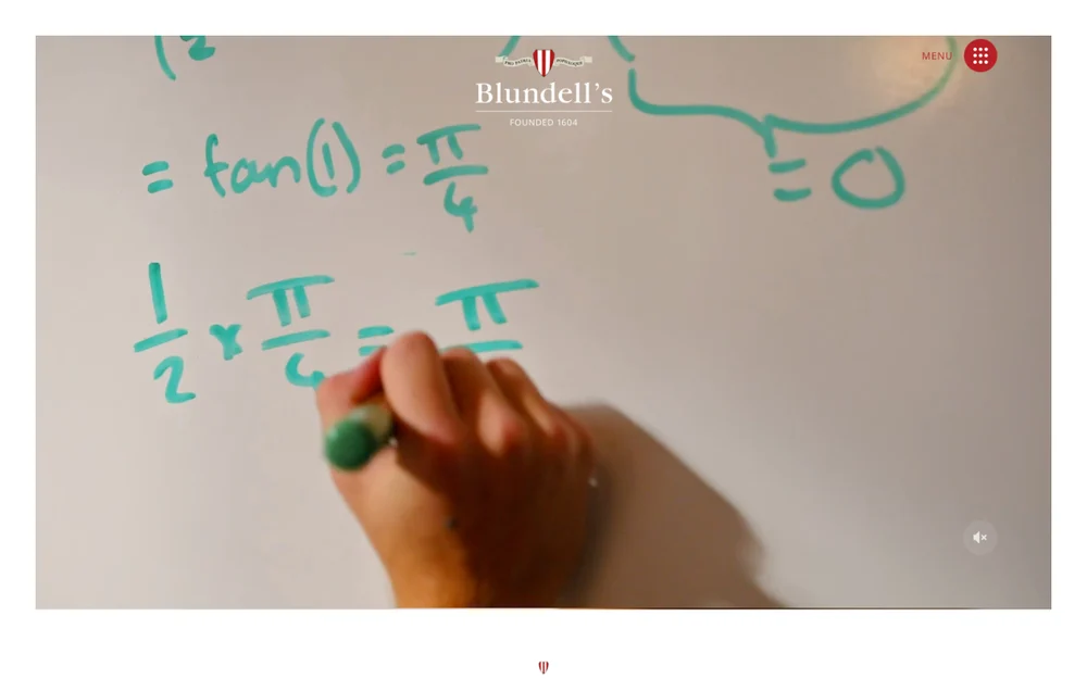
blundells.org
07
7. Blundell's School UK
A heritage site (founded 1604) whose numbered school journey is its best idea.
What works
Clarity up front: Day school from age 3-18, Boarding from 11-18 sits right under the hero, so parents instantly know if it fits.
A genuinely useful Blundell's journey graphic walks the five stages, Nursery, Pre-Prep, Prep, Senior, Sixth Form, with photos and numbers, showing the full path at a glance.
Heritage handled well: Founded 1604, an elegant serif system and a Head's pull-quote about education being more than exam results build trust and personality.
Location sold as a benefit: the Idyllic Location section names concrete anchors, two hours to London, the Jurassic Coast, Dartmoor, instead of vague beautiful campus claims.
A strong award row in the footer (Good Schools Guide, Cricketer Top 100, Muddy Stilettos) reinforces credibility.
What needs work
The autoplay video hero, a hand writing equations, is abstract; it looks elegant but does not immediately say school or show pupils, and full-screen video is a load-speed cost.
The main admissions action sits at the very bottom and the top nav hides everything behind a single Menu, so the first screen has no obvious next step.
Elegant serif body text at small sizes, especially the right-aligned paragraphs, is harder to read than a clean sans.
What to stealMap the whole school as a numbered journey from Nursery to Sixth Form so parents see the full path at a glance.
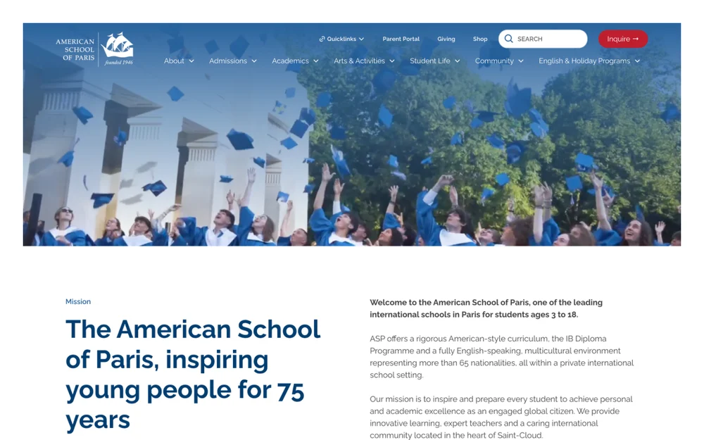
asparis.org
08
8. American School of Paris France
A clear, professional international school site that gets parents the facts and the Inquire button fast.
What works
Leads with the facts parents need: the hero gives 75 years, and the intro immediately states ages (3 to 18), curriculum (American plus the IB Diploma) and 65 nationalities. No guessing.
Inquire is a high-contrast red button fixed in the header, and the footer repeats Inquire, Visit and Apply, so the next step is always visible.
A clean Why families choose ASP benefit grid and an FAQ that answers real relocation questions (Is ASP suitable for families relocating to Paris) serve an international, mobile audience.
Outcomes are shown, not claimed: Our graduates are following their dreams with a View university acceptances link.
A trustworthy navy-and-red system with visible accreditations (MSA CESS, CIS, IB).
What needs work
The design is safe and conventional; it is clear and credible but lacks a distinctive, ownable visual idea, it could be many international schools.
The hero is a stock-feeling graduation photo; candid, everyday classroom life would feel more authentic.
The homepage is long and benefit-card heavy; tightening would get parents to the FAQ and Inquire faster.
What to stealState ages, curriculum and key facts in the first two lines, and keep an Inquire button fixed in the header.
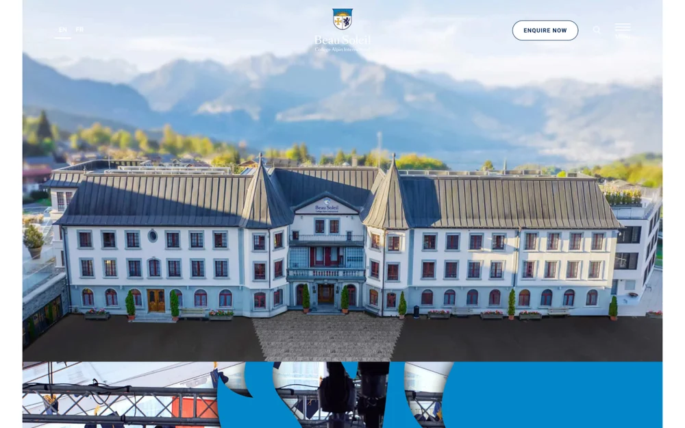
beausoleil.ch
09
9. Beau Soleil Switzerland
A premium alpine boarding site (College Alpin International, ages 11-18, around 300 students) that sells luxury and personalised education.
What works
A premium, ownable look: cinematic alpine photography, organic blob and wave section shapes, and a navy-and-gold palette signal luxury boarding at a glance.
Enquire Now is a clear, high-contrast button fixed top-right, and an EN/FR language toggle serves the international audience from the first screen.
Strong self-select navigation: an Explore tab strip (Home, Academic, Boarding, Co-curricular) plus an interactive campus tour map with video hotspots let families explore on their terms.
Honest, specific facts: founded 1910, around 300 students, ages 11-18, almost all full-time boarders, IB and Advanced Studies Diploma, with the small scale used as a selling point.
Real proof and personality: a Principal's quote by name (Benjamin Turner), outdoor-adventure photography backing the experience claims, and a genuine student-life collage.
What needs work
The hero is striking but text-light; the value proposition only appears after the fold, so the first screen is mostly a (beautiful) building shot.
The organic blob section shapes are distinctive but can crop or crowd photos and text awkwardly on some breakpoints.
It is image-heavy and long; lots of large alpine photography is a load-speed cost on mobile, and repeated Uncover and Find Out More button pairs blur the primary action.
What to stealFrame a small student body as exclusivity, around 300 students, limited places, apply early, instead of hiding it.
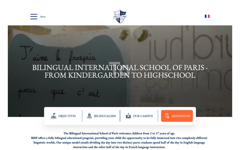
bilingualschoolparis.us
10
10. Bilingual International School of Paris France
A clean, classic site whose whole identity is built around one strong differentiator: true 50/50 bilingualism.
What works
The bilingual USP is unmistakable: the hero, the 100% bilingual stat and the half day English, half day French model are stated plainly and early, so the differentiator lands at once.
A clear tab bar over the hero (Objectives, Bilingualism, Our Campus, Admissions) lets parents jump straight to the section they care about.
Concrete proof in the stats band: 100% bilingual, 32 nationalities, classes capped at 12-14, ages 3-17, plus Pearson Edexcel and Cambridge accreditation.
A genuine French language toggle for a bilingual audience, and a charming on-theme hero, a child's French writing, instead of generic stock.
Programme explained stage by stage, Preschool, Primary, Middle, High, so parents find their child's level quickly.
What needs work
The hero headline sits over a busy image at lower contrast; a scrim or solid panel would make the title easier to read.
The design is clean but fairly conventional; the bilingual story is strong enough to deserve a more distinctive visual treatment.
Body copy runs long in places; tighter, more scannable blocks would help busy parents.
What to stealPut your single biggest differentiator in the hero, the stats and the headline so it cannot be missed.
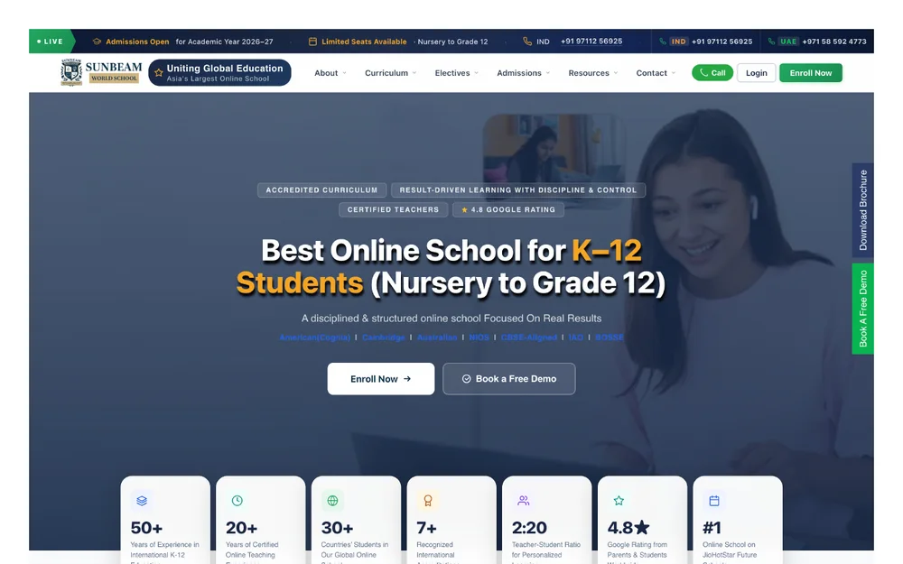
sunbeamworldschool.com
11
11. Sunbeam World School India / UAEOnline school
A bright, conversion-focused online school built around a clear claim and low-friction admissions.
What works
A clear hero claim, Best Online School for K-12, with dual calls to action: Enroll Now and Book a Free Demo.
A trust stack up top: accreditation and curriculum badges, a 4.8 Google rating, and a row of proof stats.
A live admissions bar with click-to-call for India and the UAE, strong for its target geography.
What needs work
The hero is busy: badges, stats, two CTAs and a background photo all compete for the first glance.
It leans on claim-heavy marketing language; more authentic classroom and campus imagery would balance it.
Bright-on-bright sections can strain text contrast in places.
What to stealMake virtual tours and a low-friction inquiry or demo the centre of the page.
At-a-glance comparison
If you only have a minute, this table sums up every school by country, its standout design feature and the move worth stealing. Use it as a checklist for your own redesign.
School
Country
Standout feature
What to steal
★ bina (Author's Choice)
Global, online
Fear-first copy that names the parent's worry out loud: a child genuinely known by their educators, not lost in a classroom of 30.
Lead with the parent's fear, show a real day in the life, and put pricing and proof on the page.
1. The Walker School
USA
A proof-led hero: a specific, verifiable claim, Cobb County's Best Private School for the eighth year running, named by Niche, instead of a generic welcome.
Open the homepage with one specific, third-party-verified claim instead of a generic welcome line.
2. The Dunham School
USA
A self-select Experience Dunham tab strip lets families jump straight to academics, athletics, arts, spiritual life, student life or community.
Add an Experience tab strip so parents can jump straight to academics, athletics or student life instead of scrolling everything.
3. Brentwood Academy
USA
A genuine candid hero photo plus a clear mission line lands an emotional, mission-led message immediately.
Put concrete outcome numbers near the top and keep an Apply Now button in the header on every page.
4. Gordonstoun School
UK
The hero, a lone student sailing a dinghy at sea, communicates outdoor, character-building education instantly, with no copy needed.
Let real adventure photography carry the positioning, then make the enquiry button as visible as the story.
5. Greenhill School
USA
A confident editorial system, cream and forest green, serif display over a clean sans, that feels premium and timeless rather than templated.
Use then-and-now storytelling to tie heritage to ambition, and label student testimonials by name and class year.
6. Kent College, Canterbury
UK
Outstanding age-banded navigation: every stage, Nursery 0-3, Junior 3-11, Senior 11-16, Sixth Form 16-18, Boarding 8-18, is labelled with its age range, so parents self-select in one glance.
Label every school-stage nav item with its age range so parents self-select in one glance.
7. Blundell's School
UK
Clarity up front: Day school from age 3-18, Boarding from 11-18 sits right under the hero, so parents instantly know if it fits.
Map the whole school as a numbered journey from Nursery to Sixth Form so parents see the full path at a glance.
8. American School of Paris
France
Leads with the facts parents need: the hero gives 75 years, and the intro immediately states ages (3 to 18), curriculum (American plus the IB Diploma) and 65 nationalities. No guessing.
State ages, curriculum and key facts in the first two lines, and keep an Inquire button fixed in the header.
9. Beau Soleil
Switzerland
A premium, ownable look: cinematic alpine photography, organic blob and wave section shapes, and a navy-and-gold palette signal luxury boarding at a glance.
Frame a small student body as exclusivity, around 300 students, limited places, apply early, instead of hiding it.
10. Bilingual International School of Paris
France
The bilingual USP is unmistakable: the hero, the 100% bilingual stat and the half day English, half day French model are stated plainly and early, so the differentiator lands at once.
Put your single biggest differentiator in the hero, the stats and the headline so it cannot be missed.
11. Sunbeam World School
India / UAE
A clear hero claim, Best Online School for K-12, with dual calls to action: Enroll Now and Book a Free Demo.
Make virtual tours and a low-friction inquiry or demo the centre of the page.
The pattern across all 20: clear audience paths, real imagery, and a visible admissions action on every page.
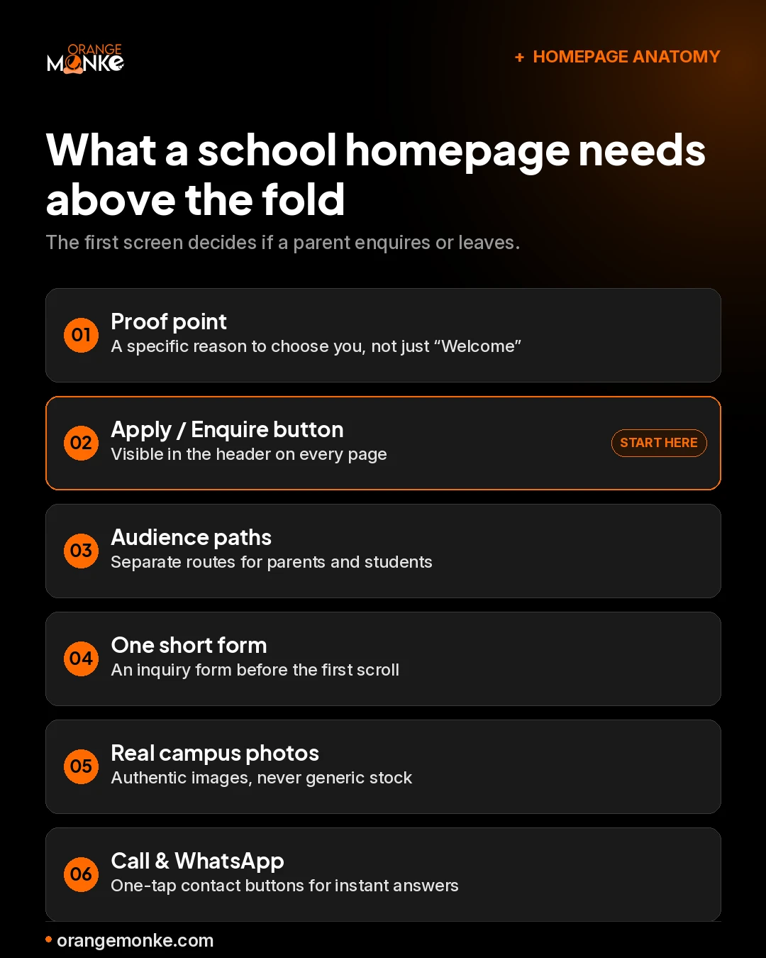
School website design ideas you can steal
The best ideas above share one thing: they earn the enquiry on the first screen. Before a parent scrolls, your homepage has already answered who you are for and what to do next.
Here is what that first screen needs. Treat it as a homepage checklist, not a wish list.
What a school homepage needs above the fold, before a parent scrolls.
Lead with a proof point, not a greeting. Replace a generic "Welcome to our school" with one specific reason to choose you: a result, an outcome, or a defining difference stated plainly.
Make the difference a navigation item. If your school's strength is outdoor learning or a STEM focus, give it a place in the menu, not a buried paragraph in the About page. For more ideas on standout web experiences, see our roundup of the most interesting websites on the internet.
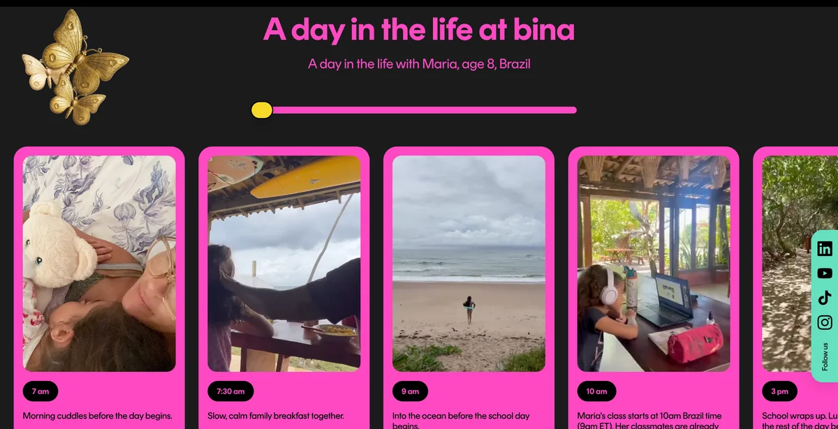
Steal these from bina, our Author's Choice
bina (thebinaschool.com) is the boldest site in this roundup, and the good news is that most of what makes it work is copyable on a smaller budget. Here is what we would borrow, as your design team.
bina's "day in the life" section: real photos and timestamps from one student's actual day.
Lead with the parent's fear, not features. bina's hero and its "this is for you if" cards say the worry out loud, a child "genuinely known by their educators, not lost in a classroom of 30," instead of listing benefits. Name the fear first, then resolve it.
Show a real day in the life. The reel-style strip above walks through one student's actual day with timestamps and candid phone photos. It convinces because it looks real, not staged. A school can film this on a phone.
Put pricing and proof on the page. bina shows exact monthly fees, sibling discounts and funding options, alongside accreditation logos and parent testimonials with real faces and names. Transparency removes the friction that makes parents bounce to email you the same question.
Own one colour system and commit to it. A dark canvas with a vivid, consistent palette and a single art direction makes the brand unmistakable across every section. You do not need bina's exact look, you need one look used everywhere.
Let visitors self-qualify. The "this is for you if" cards help a parent decide in seconds whether the school fits, which quietly pre-qualifies the enquiries that reach your admissions team.
Make the first step tiny. bina's call to action promises a "2 min form" and an intro call. Naming the effort lowers the barrier far more than a generic "Contact us."
What platform should you build a school website on?
The best platform for a school website is the one your staff can keep updated without a developer. The technology matters less than who owns the content after launch.
WordPress suits schools that want flexibility, a large plugin ecosystem and full control over design. A dedicated school CMS suits non-technical teams who need events, news and admissions built in. Site builders like Squarespace and Webflow suit small schools that prioritise speed of launch, or design-led teams that want polished school website templates without heavy code. For larger institutions, a headless CMS paired with a custom front end gives the most performance and flexibility.
If you are weighing the most common options, our breakdown of Shopify vs WordPress covers the trade-offs in flexibility, cost and maintenance that apply to school sites too.
Best practices for a show-stopping school website
A show-stopping school website is not about decoration. It is about combining clear design with functionality that serves parents and students. These ten practices separate the sites that convert from the ones that merely exist.
1. Clear, parent-first navigation
Put admissions, academics, fees, calendars and contact within one or two clicks. A great school website anticipates what families search for and surfaces it, instead of forcing them to dig.
2. Strong visual storytelling
Use real classroom moments, campus life and student achievements. Authentic imagery builds emotional connection and trust before the first visit.
3. Mobile-optimized design
Most parents browse on phones, so responsiveness is non-negotiable. Pages should load fast, keep text readable and let forms and menus work smoothly on small screens.
4. Compelling homepage messaging
Within seconds, the homepage should answer who the school is for, what makes it different and how to take the next step. Strong headlines and visible calls to action turn visitors into enquiries.
5. Clear admissions pathways
Simplify the journey with step-by-step processes, downloadable resources, FAQs and inquiry forms. Reducing confusion reduces drop-off.
6. Authentic content over stock language
Parents value honesty over polish. Real voices, student stories and genuine achievements feel more trustworthy than glossy marketing copy.
7. Accessibility and inclusivity
Meet WCAG 2.1 AA with readable fonts, proper contrast, alt text and clear language. Accessibility serves every visitor and supports your rankings at the same time.
8. Fast load speed and performance
Slow sites lose attention. Optimised images, clean code and reliable hosting improve experience, and since page speed is a ranking factor, they help visibility too. Our guide on how page speed affects SEO rankings shows what to fix first.
9. Integrated communication tools
Calendars, newsletters, announcements and portals keep families informed and position the website as a reliable, always-updated hub.
10. SEO-friendly structure
Clean URLs, structured headings and internal links help parents find you in search. If you are starting from scratch, see how to start SEO for a small or new website.
Case study: how we built Sunbeam World School's website
Sunbeam World School is a full-time online school for K-12 students across India and the UAE. Orange MonkE designed and built the site around a single goal: turn a first-time visitor into an enrolment or a booked demo. We featured it in the roundup above; here is the story behind the homepage.
The Sunbeam homepage we designed and built: one claim, two clear actions, and the proof to back them, all above the fold.
A conversion-first hero
The first screen states the claim in plain words, Best Online School for K-12, and gives two clear next steps: Enroll Now and Book a Free Demo. Nothing competes with those two actions. A parent who lands here knows what the school is and what to do in seconds.
A trust stack that earns the click
Online schooling is a trust purchase, so the proof sits up top, not buried. Accreditation and curriculum badges, a 4.8 Google rating and a row of hard numbers, years running, countries served, and the student-to-teacher ratio, answer the "is this real?" question before the parent has to ask it.
A geo-aware admissions bar
The audience spans two countries, so the admissions bar carries click-to-call numbers for both India and the UAE, with an always-visible "Admissions Open" cue. On a phone, a parent taps once to reach the right team in their own region.
Built mobile-first
Almost all of this audience arrives on a phone, so the layout, the calls to action and the call buttons were designed for small screens first. The page stays fast and the inquiry path stays short, which is what keeps a casual visitor from bouncing.
This is the approach we bring to every build: design every screen around the one action that matters. If you want a school or online-education site that turns visits into enrolments, see our website design and development services.
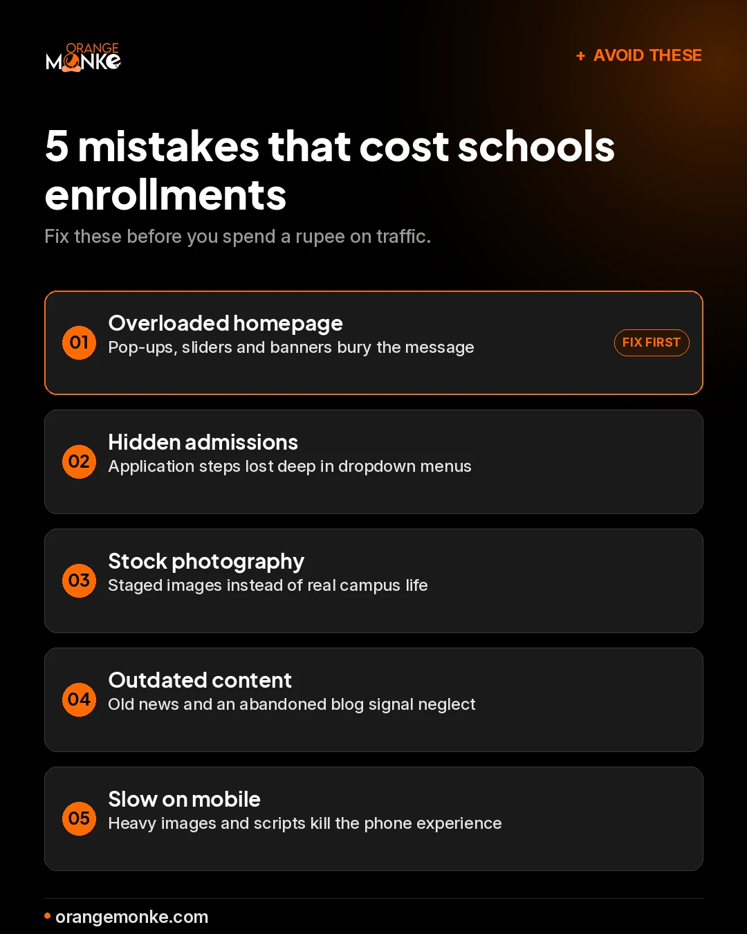
Common mistakes school websites still make
Even visually impressive school websites fall short on usability. These five mistakes quietly cost schools enquiries, and most are quick to fix.
The five mistakes to fix before spending anything on traffic.
Overloaded homepages bury the message under pop-ups, sliders and banners. Buried admissions hide application steps in dropdown menus, frustrating the very visitors most likely to convert. Generic stock photography reads as inauthentic the moment a parent recognises it.
Outdated content signals neglect: old news and an abandoned blog make parents question the school's standards. Slow, media-heavy pages push mobile visitors away and drag down rankings.
What parents look for on a school website
Parents are not browsing, they are evaluating whether your school is right for their child. A site that answers their concerns quickly earns trust and enquiries.
Academic credibility and curriculum clarity
Parents want to know what their child will learn and how. Clear curriculum details, grade-wise breakdowns and accreditation help them assess quality.
Safety, values and community culture
Ethos matters as much as academics. Information on safety, pastoral care and the values you promote reassures families.
Fee transparency and admission timelines
Unclear fees and timelines create friction. Easy-to-find tuition, scholarship and deadline information increases the chance a parent completes an enquiry.
Proof of outcomes
Exam results, university placements, notable alumni and awards act as trust signals. Showing outcomes helps families gauge long-term impact.
Key features that convert leads into admissions
A school website is an admissions tool, not a digital brochure. The right features turn it into a steady lead generation engine, guiding parents from exploring to enquiring and on to an open day or open house booking. Consistent school branding across every page makes that journey feel trustworthy. These five features do the heavy lifting.
Feature
What it does
Why it matters
Inquiry forms above the fold
Short, clear forms in the first visible section let parents request information without scrolling.
Reduces friction and captures more leads.
Virtual campus tours
360 images or video tours give parents a real feel for the campus from home.
Builds trust and helps families picture their child there.
Click-to-call and WhatsApp
One-tap options connect parents to the admissions team instantly.
Removes barriers and speeds up decisions.
Lead magnets
Downloadable prospectuses and curriculum guides offer detailed information.
Captures contacts for follow-up.
Automated follow-up
Email and CRM integrations send confirmations and nurturing sequences.
Keeps the school top of mind and improves conversion.
To make follow-up work, you need somewhere to send enquiries. Here is how to build an email list that nurtures prospective families.
What does a school website cost, and how do you choose a partner?
A school website costs anywhere from a modest template build to a larger custom project, depending on scope. The real drivers are page count, the integrations you need, and how much original photography and copy you create.
Budget builds work for small schools that need a clean, mobile-friendly presence on a template. Mid-range custom builds suit schools that want a distinct brand and a proper admissions flow. Full custom projects fit large or multi-campus schools that need CRM integrations, multilingual support and ongoing optimisation.
When choosing a partner, look for a portfolio of school or education sites, an understanding of accessibility standards, and clear post-launch support. The best partner makes the process collaborative and keeps you in control of content after launch.
India, Dubai and international: designing for a global audience
School website expectations now cross borders. International and city-specific schools compete for families who research in several languages and from several countries before they ever visit.
For international and Gulf schools, seamless language switching, culturally aware content and consistent branding make the experience inclusive. For schools in India, mobile-first performance matters most, since the majority of parents research on phones. With offices in the US, UAE and India, this is exactly the kind of cross-market design we build for every day.
Future trends in school website design 2026
Design is moving beyond aesthetics into intelligent, personalised, inclusive experiences. These trends will define the next generation of school sites.
AI-powered chatbots for admissions
Next-generation chatbots guide parents through personalised admission journeys, recommend programs and even schedule tours automatically.
Personalized content journeys
Sites increasingly adapt content to the visitor, so a parent exploring early years sees different content and CTAs than one looking at senior school.
Video-first homepages
Short-form video becomes the primary storytelling medium, showing classrooms, events and campus culture in a way static pages cannot.
Multilingual and global support
International schools demand seamless language switching and culturally sensitive content to stay accessible to families worldwide.
Data-driven UX improvements
Analytics and AI let schools continuously refine navigation, content placement and conversion flows based on real behaviour.
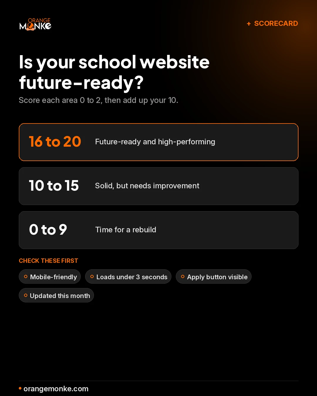
Is your school website future-ready? Take the scorecard test
Use this scorecard to grade your own site. Score each of the ten questions from 0 to 2, then add up your total out of 20.
Score each area 0 to 2 and add up your total out of 20.
Quick question
Score 0 to 2
Recommended action
Does your site display perfectly on phones and tablets?
0 No, 1 Partly, 2 Fully responsive
Optimise layouts, buttons and font sizes for all screens.
Are inquiry and application buttons easy to find?
0 Hidden, 1 Somewhat, 2 Prominent
Place CTAs above the fold on every key page.
Is news and curriculum info updated in the last 30 days?
0 Outdated, 1 Partly, 2 Current
Keep a content calendar and schedule updates.
Are pages optimised with titles, headings and meta?
0 No, 1 Partly, 2 Fully
Run SEO audits and target parent-focused keywords.
Can all users, including those with disabilities, access content?
0 No, 1 Partly, 2 Fully
Follow WCAG: alt text, contrast, keyboard navigation.
Does your site load in under 3 seconds?
0 Slow, 1 Moderate, 2 Fast
Optimise images, reduce scripts, use reliable hosting.
Are chatbots, tours, calendars or lead forms integrated?
0 None, 1 Some, 2 Fully
Add AI chat, inquiry forms and virtual campus tours.
Does the site adapt content for parents, students or staff?
0 No, 1 Partly, 2 Fully
Use segmentation for tailored experiences.
Are real videos, galleries and campus visuals used well?
0 None, 1 Partly, 2 Fully
Add homepage video, classroom clips and student highlights.
Are analytics used to optimise navigation and CTAs?
0 None, 1 Some, 2 Fully
Use analytics, heatmaps and A/B testing.
16 to 20: Future-ready and high-performing.
10 to 15: Solid, but needs improvement.
0 to 9: Time for a rebuild.
How Orange MonkE can help your school stand out
Building a school website that engages parents and drives admissions takes more than a pretty design. Orange MonkE combines strategy, creativity and technology to build sites that perform.
Your school website is the front door to your community and your future growth. The most effective sites of 2026 do not just inform, they engage, reassure and convert visitors into confident families.
Learn from the schools above, fix the mistakes that cost enquiries, and adopt the features that move parents to act. Run the scorecard, find your gaps, and if you would rather hand the rebuild to a team that does this every day, we are ready when you are.
An effective school website in 2026 combines parent-first navigation, authentic content, mobile-first design and a clear admissions path. It answers who the school is for and how to apply within the first screen, then backs it up with real photos, fast load times and accessible layouts. This is the core of good school website design and development.
A school website should be updated at least once a month, covering news, events, curriculum changes and admissions dates. Fresh content reassures parents that the school is active and helps the site hold its rankings in both search engines and AI answers, which is one of the most reliable ways to keep organic traffic growing.
A school website typically costs anywhere from a modest template build to a larger custom project, depending on scope, integrations and content. The real drivers are the number of pages, whether you need admissions and CRM integrations, and how much original photography and copy you create. We break the budget down further in the cost and choosing a partner section above.
The best platform for a school website depends on who maintains it: WordPress suits teams that want flexibility, while a dedicated school CMS suits non-technical staff who need events, news and admissions built in. Webflow is a strong middle ground for design-led teams. The right choice is the one your staff can keep updated without a developer, and our Shopify vs WordPress comparison covers the trade-offs that apply here too.
The most important pages on a school website are Admissions, Academics, Student Life, Fees, Events, Faculty and Contact. Parents also value news updates, alumni outcomes and resources such as virtual tours and prospectus downloads, the exact things we cover in what parents look for below.
A school website improves admissions by making the next step obvious: a visible Apply or Enquire button, a short inquiry form, virtual tours, FAQs and click-to-call or WhatsApp support. Showcasing achievements, curriculum and campus culture gives parents the confidence to take that step, and a purpose-built school website design turns that confidence into enrolments.
To make a school website mobile-friendly, use responsive layouts, readable text, tap-friendly buttons, compressed images and fast-loading pages. Since most parents browse on phones, a smooth mobile experience lowers bounce rates and supports better rankings, and page speed is a confirmed ranking factor on mobile.
Accessibility matters for school websites because every parent and student, including those with disabilities, needs to navigate the content easily. Meeting WCAG 2.1 AA with proper contrast, alt text, keyboard navigation and clear language improves usability, supports compliance and strengthens trust, and it overlaps heavily with the basics of good technical SEO.
The best school websites in 2026 combine intuitive navigation, authentic storytelling, mobile-first design and strong admissions features. Standout examples include The Walker School, The Dunham School, Gordonstoun, Kent College, Beau Soleil and Sunbeam World School, all reviewed in the full roundup above.
Alex Wilson writes content that ranks and converts. With over a decade of experience creating SEO-optimized articles, guides and landing pages for Orange MonkE's clients, she specializes in turning complex marketing strategies into clear, actionable content that drives business results. Her approach combines thorough research, strategic keyword targeting and reader-first writing, ensuring every piece serves both search engines and the humans reading it.
Follow the expert:
orangemonke.com
All school websites featured in this article are shown for editorial and educational commentary. The screenshots, logos and trademarks remain the property of their respective owners. Orange MonkE claims no rights over these designs and is not affiliated with the schools shown. The analysis reflects our own independent observations, offered in good faith with no intent to criticise unfairly or to harm any school or site owner. If you own a site featured here and would like a change, contact us and we will be glad to help.
🍪
We value your privacy
×
We use cookies to run the site, analyze traffic and improve your experience. You choose what we may use. Read our Privacy Policy.
Strictly necessary
Required for the site to function. Always on.
Analytics
Helps us understand how the site is used.
Marketing
Personalized content and ad measurement.
Start the conversation
Let's build something worth talking about.
Tell us where you are, where you want to be, and what's standing in the way. A senior strategist — not a sales rep — reads every form.